Introduction
Welcome to the world of color psychology in branding! I’m excited to guide you through this fascinating subject, which, while often overlooked, can have a profound impact on how your brand is perceived.
Color psychology is the study of how different colors can elicit specific emotions and behaviors. In the context of branding, it’s about choosing colors that help you communicate your brand identity to your target audience in the most effective way possible. This is no simple task: color is not just a matter of personal preference but rather an intricate science that involves understanding cultural, demographic, and individual responses.
As a coach stepping into digital marketing, you may be wondering how important this really is. Think about some of the most iconic brands in the world – Apple’s minimalist white, Starbucks’ inviting green, or Coca Cola’s vibrant red. These colors weren’t chosen randomly. They are carefully selected elements of a broader branding strategy, specifically chosen to resonate with their target audiences and communicate a certain image or feeling.
This blog post aims to demystify the science of color psychology, providing you with the knowledge you need to make informed choices about your own branding. We’ll delve into the meanings associated with common colors, study the usage of color by successful brands, and explore how to apply these insights to your own brand. We’ll also discuss common mistakes to avoid, and provide tips on how to refine your color strategy.
Whether you’re reevaluating your current color choices or starting from scratch, understanding color psychology can be a game-changer. It’s time to unleash the power of color and elevate your brand to new heights!
Stay tuned as we dive into the vibrant world of color psychology in branding. The journey towards building a more impactful brand starts here.
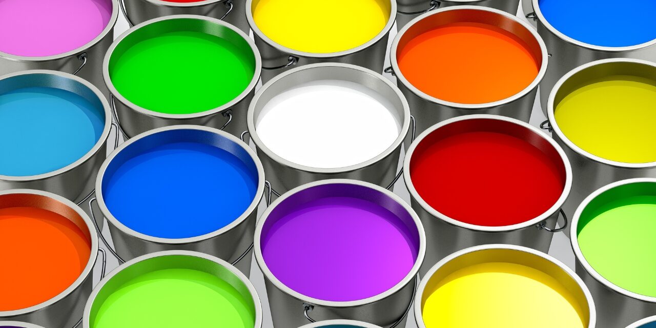
Understanding the basics of color psychology
Color psychology is an intriguing field that examines how hues influence our behaviors, moods, and decisions. Each color has an emotional and psychological value. Therefore, the colors you choose for your brand can greatly influence how potential clients perceive and interact with it.
Colors are powerful non-verbal communication tools. They have the ability to evoke emotions – from tranquility to anger, excitement to sadness. For instance, blues often convey a sense of calm and trust, while reds can inspire feelings of passion and energy. It’s vital to understand that these emotional responses are typically subconscious, which means your audience is often unaware of how color sways their perception.
But it’s not as simple as assigning a one-size-fits-all emotional response to each color. These associations can vary based on cultural, demographic, and personal factors. For example, while white is often associated with purity and cleanliness in Western cultures, in some Eastern cultures, it symbolizes mourning and death.
Moreover, age, gender, and personal experiences can also influence how colors are perceived. What feels warm and inviting to one person might feel overwhelming and garish to another. This makes understanding your specific target audience’s color preferences crucial.
In branding, color can be used strategically to guide specific consumer responses. By understanding color psychology, you can align the colors of your brand with your business values and the emotions you want to evoke in your audience.
Finally, remember that it’s not only about the individual colors but also about how they interact together. Complementary colors can create balance, while contrasting colors can make your brand more striking and memorable.
As you begin to understand the basics of color psychology, you’ll realize the wealth of opportunities it opens up for your branding strategy. It’s like learning a new language – the language of colors!
Detailed look into color meanings in marketing and branding
Now that we’ve discussed the basics of color psychology, let’s delve deeper into the specific meanings of common colors in branding and marketing. Understanding these associations will help you choose colors that embody your brand’s ethos and appeal to your target audience.
1. Red:
- Red is a color of passion, excitement, and energy. It’s bold and attention-grabbing, often associated with urgency or important actions. That’s why you’ll often see it used in clearance sales and ‘buy now’ buttons. A brand that uses red, such as Coca Cola, wants to be seen as lively, bold, and impactful.
2. Blue:
- This color is widely used in corporate branding due to its associations with trust, dependability, and strength. It evokes feelings of calm and serenity and is often used by tech and finance companies who want to convey stability and trust, like Facebook and IBM.
3. Green:
- As you might expect, green is associated with nature, growth, and health. It brings a sense of peace and tranquility. Companies that want to position themselves as eco-friendly, healthy, or growth-oriented often use green in their branding, such as Starbucks or Whole Foods.
4. Yellow:
- Yellow signifies optimism, warmth, and creativity. It’s cheerful, bright, and can stimulate mental activity. Brands that want to come across as friendly, youthful, and positive tend to use yellow, like McDonald’s or Nikon.
5. Purple:
- Purple conveys a sense of luxury, wisdom, and mystery. It’s often used by brands that want to depict sophistication and exclusivity, such as Cadbury or Crown Royal.
6. Black:
- Black is powerful and sleek. It communicates elegance, sophistication, and authority. Luxury brands like Chanel and Louis Vuitton utilize black to project an image of exclusivity and high-end quality.
7. White:
- White is often associated with simplicity, cleanliness, and purity. It suggests a minimalist, modern aesthetic that is popular with tech brands like Apple or health-focused brands like Dove.
Remember, the effect of color on consumers can be nuanced. A color can prompt different reactions depending on its context, the shades and tints used, and the colors it’s paired with. Hence, experimenting with different color combinations is just as important as understanding the implications of individual colors.
Equipped with this color knowledge, you’re one step closer to constructing a brand identity that not only resonates with your coaching style but also with your clients’ expectations.
Case Studies: Successful use of color psychology in branding
Understanding the theory behind color psychology is one thing, but seeing it in action really brings the concept to life. Let’s take a look at a few brands that have successfully leveraged color psychology to build a strong brand identity.
1. Coca Cola:
- Coca Cola’s branding is a classic example of effective color psychology. The vibrant red in their logo matches perfectly with the energetic, bold personality the brand projects. The red also helps create a sense of urgency and excitement, enticing customers to quench their thirst with a refreshing Coke.
2. Tiffany & Co.:
- Tiffany’s is synonymous with its distinctive robin’s egg blue, a color that is now officially trademarked as ‘Tiffany Blue.’ This color choice reflects the brand’s image of timeless elegance and luxury. The distinctive blue boxes evoke a sense of anticipation and excitement, creating an unforgettable customer experience.
3. Starbucks:
- The Starbucks brand has become nearly synonymous with its forest green logo, a color that evokes feelings of peace, growth, and health. This aligns perfectly with Starbucks’ mission to inspire and nurture the human spirit. The color also ties in with their commitment to ethical sourcing and environmental stewardship.
4. FedEx:
- FedEx cleverly uses two strong colors, purple and orange, for their branding. Purple is associated with reliability and quality—reflecting FedEx’s dependable delivery services—while the orange communicates energy and enthusiasm. Moreover, the subtle arrow in the negative space between the ‘E’ and the ‘x’ signals forward movement, subtly reinforcing the brand’s core message of fast and efficient delivery.
These brands show how color choices can be a significant factor in shaping a company’s image. Their color schemes were not chosen haphazardly but were strategic decisions based on the emotions and associations these colors would invoke in their customers.
For your coaching business, it’s crucial to make the same thoughtful considerations. What emotions do you want to evoke in your clients? What values do you want to communicate? Once you answer these questions, you can start selecting colors that will effectively communicate your brand’s identity and purpose.
Applying color psychology to your coaching brand
Incorporating the science of color psychology into your coaching brand isn’t as daunting as it may seem. By understanding your brand’s core values and the emotions you want to evoke in your clients, you can make informed decisions about your color scheme. Here’s a simple process to get started.
Firstly, define your brand personality. What are the values and principles that drive your coaching style? Are you more about inspiring creativity, promoting relaxation, driving success, or nurturing growth? Defining your brand personality will help determine which color or colors might best represent these feelings and values.
For example, if your coaching style is about sparking creativity and encouraging out-of-the-box thinking, an energetic color like yellow could be an excellent choice. On the other hand, if you aim to create a calming and relaxing environment for your clients, you might opt for a soothing blue or green.
Next, consider your target audience. What age range, gender, and demographic are you aiming to attract? Keep in mind that color perceptions can vary based on these factors, so it’s crucial to align your color choices with your audience’s preferences.
Once you’ve selected your color palette, ensure it is used consistently across all platforms and mediums. From your logo and website to your social media platforms and marketing materials, consistency is key. This helps reinforce your brand identity and build recognition over time.
In the digital age, first impressions are often made online, and color plays a significant role in this initial interaction. A thoughtful, well-chosen color palette can help to immediately convey your brand’s personality and make your coaching business stand out from the crowd. Remember, color is not merely an aesthetic choice, but a powerful branding tool that can help you connect with your clients on a deeper level.
Common mistakes to avoid when using color in branding
While color can be a powerful tool in your branding strategy, it can also lead to pitfalls if not used correctly. Here are a few common mistakes to avoid.
1. Inconsistent color usage:
- Consistency is vital in branding. Once you’ve chosen a color scheme, stick to it across all platforms and mediums. This helps to build recognition and reinforce your brand identity.
2. Ignoring your target audience:
- While you might love a particular color, it’s essential to consider your target audience’s preferences and perceptions. Different demographics respond to colors in varied ways, so always keep your audience in mind when making color choices.
3. Overcomplicating your color palette:
- While it’s tempting to use a wide array of colors, simplicity is often more effective. A complex color scheme can confuse your audience and dilute your branding. Stick to a few core colors that best represent your brand.
4. Neglecting to consider color implications:
- Each color has specific associations in the realm of psychology. Failing to consider these implications could result in a mismatch between your brand’s message and the feelings your colors evoke.
Avoiding these mistakes can help ensure that your color choices effectively enhance your brand, rather than detract from it. A thoughtful approach to color in branding can truly make your coaching business shine.
Tips for testing and refining your color strategy
Refining your color strategy should be an ongoing process. Start by using A/B testing. This involves creating two versions of a page or marketing asset with different color schemes and comparing their performance. You could test varying shades of a color, or try entirely different colors to see what resonates with your audience.
Also, be open to feedback. Ask your clients, colleagues, or mentors what they think about your color choices and if they align with your brand’s personality.
Remember, refining your color strategy is a journey. It’s perfectly fine to tweak and adjust as you learn more about your brand and your audience.
Conclusion
Color psychology is a powerful tool in the realm of branding. It has the potential to convey your brand’s personality, connect with your target audience, and set your coaching business apart in the bustling digital marketplace. By understanding the emotions and associations that different colors evoke, you can create a more impactful and meaningful brand. Be thoughtful in your color choices, consistent in your application, and open to adaptation as your brand grows. So, embrace the colorful world of branding and let the power of color psychology guide your journey towards a vibrant, resonant, and successful coaching brand.
Call to Action
Are you ready to take your brand to the next level with color psychology? It’s time to get started! Begin by evaluating your current brand colors, or if you’re starting from scratch, identify the core values and emotions you want your brand to embody. Remember, understanding your target audience is key, so keep them in mind as you explore the language of colors.
For more resources on branding and digital marketing, don’t forget to subscribe to our blog. And if you found this post helpful, please share it with other coaches who might benefit from it.
Finally, I’d love to hear from you. Share your color branding stories or any questions you might have in the comments section below. I look forward to our colorful discussions!
Remember, your brand’s color palette is a powerful tool. Use it wisely, and watch your coaching business flourish. Let the journey begin!


