Introduction
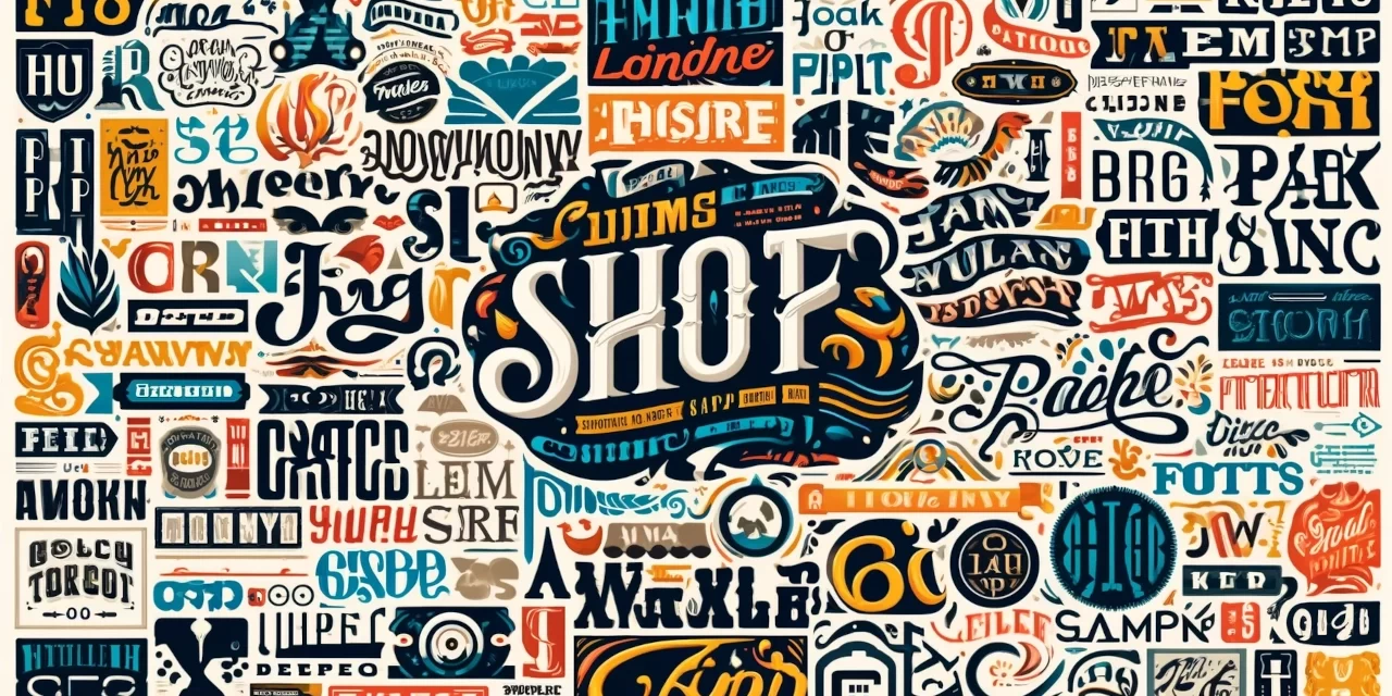
Typography is a crucial yet often overlooked element in the realm of digital marketing. It goes beyond merely choosing a font; it’s about crafting a visual language that communicates your brand’s personality and values. The significance of typography in branding cannot be overstated, as it directly influences how your audience perceives your brand.
Brand perception is the cumulative impression that consumers form about a brand based on their experiences and interactions. This perception is influenced by various factors, including visual elements like typography. When used effectively, typography can enhance brand recognition, evoke emotions, and establish a strong brand identity.
In this blog post, we will delve into the impact of typography on brand perception. Whether you’re a novice in digital marketing or looking to refine your branding strategy, understanding the role of typography is essential. We’ll explore how typography affects brand perception, offer practical tips for choosing the right fonts, and highlight successful examples to inspire your own branding efforts. Let’s embark on this journey to discover how thoughtful typography can elevate your brand’s presence and resonance in the minds of your audience.
What is Typography?
Typography is the art and technique of arranging type to make written language legible, readable, and visually appealing. It involves the selection of typefaces, point sizes, line lengths, line-spacing (leading), and letter-spacing (tracking), among other elements. In digital marketing, typography plays a pivotal role in conveying a brand’s message and personality through visual means.
At its core, typography is about more than just choosing fonts; it’s about creating a cohesive visual experience that enhances communication. Different typefaces can evoke different emotions and reactions from an audience. For example, serif fonts like Times New Roman often convey tradition and reliability, while sans-serif fonts like Helvetica suggest modernity and simplicity.
Typography affects how content is perceived and understood. Good typography ensures that your text is not only attractive but also easy to read and digest. Elements such as font size, color, and spacing can significantly impact readability and user engagement. In the context of branding, typography becomes a powerful tool to build and reinforce brand identity, making it a critical aspect of any marketing strategy. Understanding and leveraging typography effectively can help brands connect with their audience on a deeper level, enhancing overall brand perception.
The Relationship Between Typography and Branding
Typography is a foundational element in the world of branding. It shapes how a brand is perceived and can significantly influence consumer behavior. Typography in branding is about more than aesthetics; it’s about creating a distinct visual identity that communicates the brand’s values and personality.
A well-chosen typeface can convey a brand’s essence at a glance. For example, the playful and quirky typography of a brand like Coca-Cola immediately evokes a sense of nostalgia and joy. In contrast, the sleek, modern fonts used by tech companies like Apple or Google convey innovation and simplicity. These visual cues help consumers form immediate impressions about the brand, influencing their perceptions and interactions.
Consistency in typography is crucial for brand recognition. Using the same fonts across all marketing materials—from websites and social media to packaging and advertising—reinforces the brand’s identity and makes it more memorable. This consistency builds trust and familiarity, which are key components of a strong brand perception.
Furthermore, typography affects the readability and accessibility of your content. Clear, legible fonts ensure that your message is easily understood, while also enhancing the user experience. In digital marketing, where attention spans are short, effective typography can capture interest and keep your audience engaged.
In essence, typography is a silent ambassador of your brand. It works in tandem with other visual elements to create a cohesive and compelling brand image. By understanding and leveraging the impact of typography on brand perception, businesses can craft a more powerful and resonant brand identity.
How Typography Affects Brand Perception
Typography significantly influences how consumers perceive a brand. The psychological impact of typography on brand perception is profound, affecting emotions, readability, and overall brand image.
Psychological Effects of Typography
Different fonts evoke different emotional responses. Serif fonts, such as Times New Roman or Georgia, are often associated with tradition, reliability, and professionalism. These fonts are commonly used by established institutions like newspapers and universities, where trust and authority are paramount. On the other hand, sans-serif fonts like Arial and Helvetica are perceived as modern, clean, and approachable, making them popular choices for tech companies and contemporary brands.
Script and decorative fonts, with their intricate designs, can convey elegance and creativity but might compromise readability if overused. Brands in the fashion and luxury industries often use these fonts to project sophistication and exclusivity. Understanding these psychological nuances helps brands choose fonts that align with their desired image and audience expectations.
Consistency and Readability
Consistency in typography is essential for maintaining a cohesive brand identity. When a brand uses the same typefaces across its website, social media, packaging, and advertisements, it creates a unified visual language that strengthens brand recognition. This consistency builds trust, as consumers begin to associate the specific typography with the brand itself.
Readability is another critical factor. No matter how visually appealing a font is, if it’s hard to read, it will frustrate the audience and dilute the brand’s message. Effective typography balances aesthetic appeal with legibility, ensuring that the text is easy to read across different devices and mediums. This is especially important in digital marketing, where content must be quickly and easily consumed.
Impact on Brand Image
Typography directly influences brand image. A brand that uses outdated or inconsistent fonts might be perceived as unprofessional or out of touch. Conversely, a brand that carefully selects fonts to reflect its values and stays current with design trends will be seen as professional and relevant. For example, Google’s use of a clean, sans-serif font in its logo redesign in 2015 helped to modernize its image and improve readability across various digital platforms.
In conclusion, typography plays a crucial role in shaping brand perception. By carefully selecting and consistently using fonts that align with their brand identity, businesses can create a strong, positive impression on their audience. This thoughtful approach to typography not only enhances brand recognition but also fosters trust and loyalty among consumers.
Choosing the Right Typography for Your Brand
Selecting the right typography is a critical step in establishing a strong brand identity. The right font choices can enhance brand perception, making your business more memorable and engaging to your audience. Here are some essential tips for choosing the perfect typography for your brand.
Understand Your Brand’s Personality
Start by understanding your brand’s core values and personality. Are you a traditional and trustworthy institution, or a modern and innovative startup? The font you choose should reflect these characteristics. For instance, a law firm might opt for classic serif fonts like Times New Roman to convey reliability, while a tech company might choose a clean, sans-serif font like Helvetica to project modernity and simplicity.
Consider Your Audience
Your audience’s preferences and expectations should guide your typography choices. If your target market is young and trendy, contemporary fonts and playful typefaces may resonate well. Conversely, if your audience is more conservative or professional, classic and straightforward fonts will likely be more effective. Understanding your audience helps ensure that your typography appeals to the right demographic, enhancing overall brand perception.
Focus on Readability
While aesthetics are important, readability is paramount. Your text should be easy to read across all platforms, from mobile devices to desktop screens. Avoid overly decorative fonts for body text, as they can be hard to read in longer passages. Instead, use them sparingly for headings or logos to add a touch of personality without compromising clarity.
Test for Consistency
Ensure that your chosen fonts work well together and maintain consistency across all brand materials. This includes your website, social media, print materials, and any other platforms where your brand is represented. Consistent typography reinforces brand recognition and builds trust with your audience.
Seek Inspiration from Successful Brands
Look at how successful brands use typography to enhance their identity. For example, Coca-Cola’s iconic script font evokes a sense of nostalgia and joy, while Apple’s sleek sans-serif fonts communicate innovation and elegance. These examples can provide inspiration and guidance for your own font choices.
In summary, choosing the right typography involves understanding your brand’s personality, considering your audience, focusing on readability, maintaining consistency, and seeking inspiration. By carefully selecting fonts that align with your brand values and resonate with your audience, you can create a powerful and cohesive brand identity that enhances overall brand perception.
Typography Design Principles for Effective Branding
Effective typography is essential for creating a strong brand identity. By adhering to key design principles, you can ensure that your typography not only looks good but also enhances readability and conveys your brand’s personality. Here are some fundamental typography design principles for effective branding.
Legibility and Readability
Legibility refers to how easily individual characters can be distinguished from one another, while readability is about how comfortably the text can be read in context. Choose fonts that are clear and easy to read, especially for body text. Sans-serif fonts like Arial or Helvetica are often more legible on screens, whereas serif fonts like Times New Roman or Georgia can work well in print. Ensure adequate spacing between letters, lines, and paragraphs to avoid visual clutter and improve readability.
Hierarchy and Contrast
Typography hierarchy helps guide readers through your content, indicating which information is most important. Use different font sizes, weights, and styles to create a visual hierarchy. For instance, headlines should be bold and larger, subheadings slightly smaller, and body text should be regular and readable. Contrast between these elements helps to draw attention to key information and makes your content more engaging.
Alignment and Consistency
Alignment and consistency are crucial for creating a polished and professional look. Align text uniformly (left, center, or right) to create a clean, orderly appearance. Maintain consistent use of fonts, sizes, and styles across all brand materials. This consistency reinforces brand recognition and ensures that your content appears cohesive and well-structured.
White Space
White space, or negative space, is the empty area around text and graphics. It helps to reduce clutter and improve focus on the main content. Adequate white space enhances readability and gives your design a more elegant and sophisticated look. Avoid cramming too much text into a small area; instead, use white space to give your content room to breathe.
Alignment and Proximity
Proper alignment and proximity of text elements help create a balanced and harmonious design. Align text and other design elements to create a clean, organized layout. Group related items together to create visual associations and improve the overall flow of your content. This principle is particularly important for web design, where users quickly scan content.
Balance and Harmony
Achieving balance and harmony in typography involves the thoughtful arrangement of text elements to create a visually pleasing composition. This can be achieved by balancing different font weights and styles, and ensuring that no single element overwhelms the others. The goal is to create a harmonious design where all elements work together cohesively.
In conclusion, effective typography design is about more than just choosing attractive fonts. It involves understanding and applying principles of legibility, hierarchy, alignment, white space, proximity, balance, and harmony. By mastering these principles, you can create typography that enhances your brand identity, improves readability, and engages your audience, ultimately strengthening your brand perception.
Typography Trends in Branding
Staying current with typography trends is essential for maintaining a modern and relevant brand image. Typography trends evolve to reflect changes in design preferences, technology, and cultural influences. Here are some of the key typography trends in branding that can help elevate your brand perception.
Minimalism and Simplicity
Minimalist typography continues to be popular, characterized by clean, sans-serif fonts, ample white space, and straightforward design. This trend emphasizes clarity and readability, making it ideal for modern brands that value simplicity and functionality. Examples include brands like Apple and Google, which use minimalist typography to convey innovation and elegance.
Custom and Handwritten Fonts
Custom and handwritten fonts are gaining traction as brands seek to create unique and personalized identities. These fonts add a human touch and can make a brand feel more approachable and authentic. Companies like Mailchimp and Innocent Drinks use custom typography to reflect their quirky and friendly personalities.
Bold and Dramatic Fonts
Bold typography is making a statement in the branding world. Using large, impactful fonts helps brands capture attention and convey confidence and strength. This trend is especially effective in headlines and logos, where it can create a strong visual impact. Brands like Fenty and Nike often employ bold typography to stand out and communicate a powerful message.
Variable Fonts
Variable fonts offer flexibility and creativity by allowing multiple variations of a typeface within a single font file. This trend enables brands to experiment with different weights, widths, and styles while maintaining a cohesive look. Variable fonts are perfect for dynamic digital platforms, providing responsive typography that adapts to various screen sizes and resolutions.
Retro and Vintage Styles
Retro and vintage typography is making a comeback, with brands tapping into nostalgia to evoke emotional connections. These styles often feature serif fonts, ornate details, and classic design elements. Brands like Coca-Cola and Levi’s use retro typography to celebrate their heritage and create a timeless appeal.
Incorporating these typography trends can help your brand stay relevant and resonate with contemporary audiences. By embracing minimalism, custom fonts, bold designs, variable fonts, and retro styles, you can enhance your brand’s visual identity and strengthen its perception in the market.
Case Studies: Successful Brands and Their Typography
Examining successful brands and their use of typography provides valuable insights into how effective font choices can enhance brand perception. Here are a few notable examples:
Coca-Cola
Coca-Cola’s typography is one of the most iconic in the world. The brand’s signature script font has remained largely unchanged since its creation in the late 19th century. This consistency has played a significant role in building Coca-Cola’s brand identity, evoking feelings of nostalgia, happiness, and timelessness. The elegant, flowing script reflects the brand’s heritage and quality, making it instantly recognizable across the globe.
Apple
Apple’s use of typography is a prime example of minimalism and modernity. The company employs the clean, sans-serif font San Francisco across its products and marketing materials. This font choice reinforces Apple’s brand values of simplicity, innovation, and user-centric design. The legibility and sleek appearance of the San Francisco font contribute to a seamless user experience, both in digital interfaces and physical products.
Nike
Nike’s typography embodies boldness and confidence. The brand uses the custom font Nike Futura, a variation of the Futura typeface, in its logo and advertising. This bold, sans-serif font conveys strength and determination, aligning with Nike’s brand message of athleticism and empowerment. The strong, clean lines of Nike Futura make a powerful visual impact, helping the brand stand out in a competitive market.
Mailchimp
Mailchimp’s playful and approachable brand personality is reflected in its custom, handwritten-style typography. The brand uses a unique typeface that adds a human touch and conveys friendliness and creativity. This typography choice helps Mailchimp differentiate itself from more corporate competitors, making it more relatable and engaging for small businesses and creative professionals.
Google
Google’s use of typography has evolved to enhance readability and adaptability across different platforms. The introduction of the custom font Google Sans, which is part of the Product Sans typeface family, marked a significant shift. This modern, sans-serif font is clean and versatile, designed to be easily readable on screens of all sizes. Google Sans supports Google’s brand identity of accessibility, innovation, and user-friendliness.
IBM
IBM’s typography is a study in clarity and professionalism. The brand uses the IBM Plex typeface, a versatile, sans-serif font that balances modern aesthetics with a nod to the company’s heritage. IBM Plex’s design promotes legibility and is adaptable across various digital and print mediums. This typography choice supports IBM’s brand values of trust, innovation, and technological leadership.
These case studies illustrate how strategic typography choices can enhance brand perception by reinforcing brand values, improving readability, and creating memorable visual identities. By learning from these successful brands, businesses can make informed typography decisions that resonate with their audience and strengthen their overall brand identity.
The Role of Typography in Digital Marketing
Typography plays a pivotal role in digital marketing, influencing how audiences perceive and interact with a brand. Effective typography enhances readability, establishes a cohesive brand identity, and improves user experience, all of which are crucial for successful digital marketing.
Enhancing Readability and Engagement
In the fast-paced digital environment, capturing and maintaining user attention is challenging. Clear, legible typography ensures that your content is easy to read and digest. By choosing appropriate fonts and sizes, marketers can make their websites, blogs, and social media posts more engaging. Readable text encourages users to spend more time on a page, increasing the likelihood of conversions.
Building Brand Identity
Typography is integral to a brand’s visual identity. Consistent use of fonts across all digital platforms—from websites and emails to social media and online ads—reinforces brand recognition. For example, using the same typeface in all digital communications helps create a unified brand image, making the brand more memorable and trustworthy.
Improving User Experience
Good typography contributes to a positive user experience by guiding readers through the content. Hierarchical use of fonts—such as bold headings, subheadings, and body text—helps users easily navigate and find relevant information. Additionally, responsive typography that adjusts to different screen sizes ensures that your content remains accessible and visually appealing on all devices.
Supporting SEO Efforts
Typography also impacts SEO. Search engines favor websites with good user experience, and readable, well-structured text contributes to this. Proper use of typography can improve site accessibility and reduce bounce rates, positively influencing your search engine rankings. Furthermore, using web-safe fonts ensures that your text displays correctly across different browsers and devices, maintaining the integrity of your content.
In conclusion, typography is a powerful tool in digital marketing. By enhancing readability, building brand identity, improving user experience, and supporting SEO efforts, effective typography can significantly boost your digital marketing success. Thoughtful typography choices help create a compelling and cohesive brand presence that resonates with your audience.
Conclusion
Typography is far more than a mere design element; it is a powerful tool that shapes brand perception and influences consumer behavior. Through careful selection and consistent use of fonts, brands can convey their personality, values, and message effectively. As we’ve explored, the impact of typography on branding extends from enhancing readability and engagement to building a cohesive brand identity and improving user experience.
By understanding the psychological effects of different typefaces, maintaining readability, and staying current with typography trends, businesses can create a strong visual identity that resonates with their audience. Successful brands like Coca-Cola, Apple, and Nike demonstrate the profound impact that thoughtful typography can have on brand perception and market success.
In the realm of digital marketing, where first impressions are crucial and user attention spans are short, effective typography can make all the difference. As you develop or refine your brand’s visual identity, remember to prioritize typography as a key component of your strategy. By doing so, you’ll not only enhance your brand’s appeal and recognition but also foster trust and loyalty among your audience.
Call to Action
We hope this exploration of typography’s impact on brand perception has provided you with valuable insights. Now, it’s your turn to put these principles into practice. Have you considered how your typography choices are influencing your brand? Share your thoughts and experiences in the comments below. For more tips and resources on effective branding and digital marketing, subscribe to our newsletter and stay updated with the latest trends and strategies. Let’s create visually compelling and impactful brand identities together!


